Colours play a very important role in logo design. The colours that you use in a logo design help to give your logo design character while also helping it to stand out from its competition. The colors of your logo design can accentuate your brand identity or if they are used improperly, they can work against you and hinder your brand identity. Having a good understanding of colour and which colours work well together is essential when you are working with colour in logo design.
Last week, I wrote a post explaining the individual colours and their meaning in logo design (click here to view this post). Today, I am going to elaborate on this idea and further explain to you the relationship between colours in the colour wheel. By examining the colours in the colour wheel, we can learn how to create beautiful color schemes and harmonious designs.
The colour wheel is a valuable tool that helps us to better understand the relationship between colours. The colour wheel is made up of twelve colours: three primary colours (red, yellow and blue), three secondary colours (orange, green and violet) and six tertiary colours which are the colours created by mixing a primary with a secondary colour. The colour wheel also gives us some clues as to several basic colour schemes found throughout the world around us.
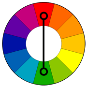
Complementary Colour Scheme
 Colours that are opposite each other on the colour wheel are considered to be complimentary colours. For example, red and green are complimentary colours as well as blue-orange and yellow-purple.
Many famous logo designs use a complementary colour scheme. The Visa logo, for example, is one of these logo designs. Its logo design uses blue and an orange-yellow. These colours are perfect for VISA as they represent authority, stability, security, loyalty, trustworthiness, quality and professionalism, all qualities that people look for when it comes to their finances.

The LA Lakers logo design also uses a complimentary colour scheme. This too is perfect for the LA Lakers as purple represents royalty and superiority whereas yellow denotes energy, vibrancy and enthusiasm.

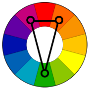
Split Complimentary Colour Scheme
 Obviously a slight variation of the complimentary colour scheme, a split complimentary colour scheme is made up of one colour plus the two colours that are on either side of its direct compliment.
There are a lot of logo designs that are created with a split complimentary colour scheme. These logo designs visually contrast and easily capture the attention of passersby. Both the Firefox logo and Taco Bell’s logo use this colour scheme.


Analogous Color Scheme
 Colours that are next to each other in the colour wheel are analogous colours. For example, red, orange and yellow are analogous. Blue, purple and magenta are also analogous. Many famous logo designs use an analogous colour scheme. These analogous logo designs match very well and are usually very pleasing to the eye.
The BP logo design and the Red Bull logo designs are both examples of analogous designs.


The McDonald’s logo design and the Fed Ex logo design also loosely use an analogous colour schemes.


Triadic Color Scheme
 Combining every fourth colour in the colour wheel forms a triadic colour scheme. For example, orange, purple and green make up a triadic colour scheme. The famous Burger King logo design uses another triadic colour scheme of the primary colours, red, blue and yellow. Triadic colour schemes tend to be quite vibrant.

